🔮 Our 2024 -2025 B Corp Impact Report Is Here 🔮
Start a project:
projects@somethingfamiliar.co.uk
Join SF:
jobs@somethingfamiliar.co.uk
Or call us on:
+44 (0) 117 329 3443
We needed to cut through a lot of existing noise in the market when we created the Hartwell brand. This was different: a real expert who actually understood the symptoms of menopause, and could help people feel like themselves again.
We began by exploring what makes Hartwell unique, what makes it tick and what makes other people care. This deep dive helped us define the new brand’s values and personality, which led us to how the brand looks and feels.
The idea of balancing Natasha’s personal and science-based approaches was a key theme in the brand’s development. We made Hartwell’s voice Natasha’s own. Everything would be first person and talking directly to the target audience – just as it would be in a one-to-one consultation – we wanted the audience to feel seen.
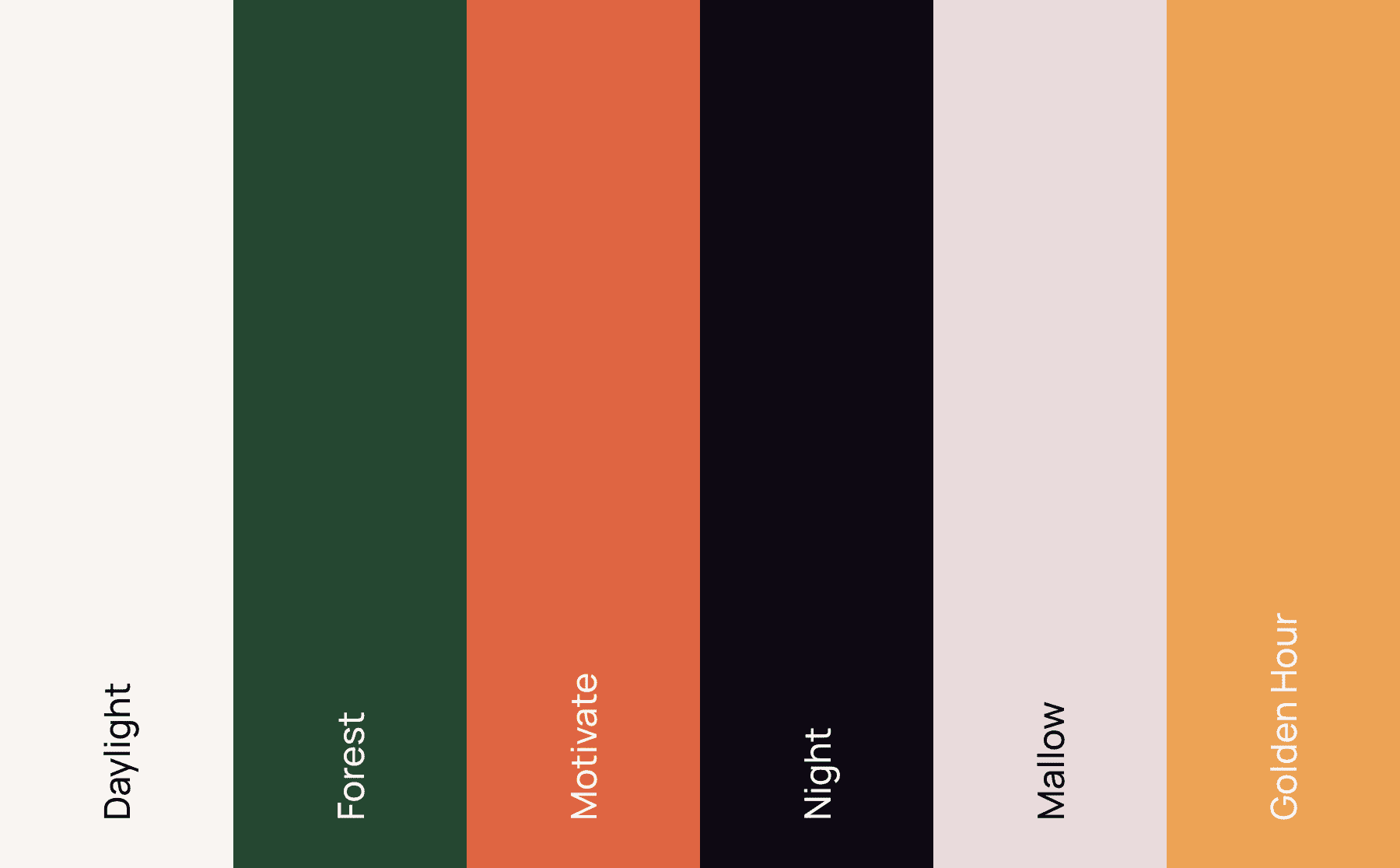
This helped to complete the circle with the logo, a hand-drawn logotype that feels very much like a signature. Our colour palette was vibrant and earthy, warm and dignified; whilst brand imagery centred on collages which connected nature with lifestyle.


Keen for more? Sign up for we’ll keep you in the loop. No spam, promise.
This website uses cookies to enhance your experience. Some are essential for site functionality, while others help us analyze and improve your usage experience. Please review your options and make your choice.
If you are under 16 years old, please ensure that you have received consent from your parent or guardian for any non-essential cookies.
Your privacy is important to us. You can adjust your cookie settings at any time. For more information about how we use data, please read our privacy policy. You may change your preferences at any time by clicking on the settings button below.
Note that if you choose to disable some types of cookies, it may impact your experience of the site and the services we are able to offer.
Some required resources have been blocked, which can affect third-party services and may cause the site to not function properly.
This website uses cookies to enhance your browsing experience and ensure the site functions properly. By continuing to use this site, you acknowledge and accept our use of cookies.