
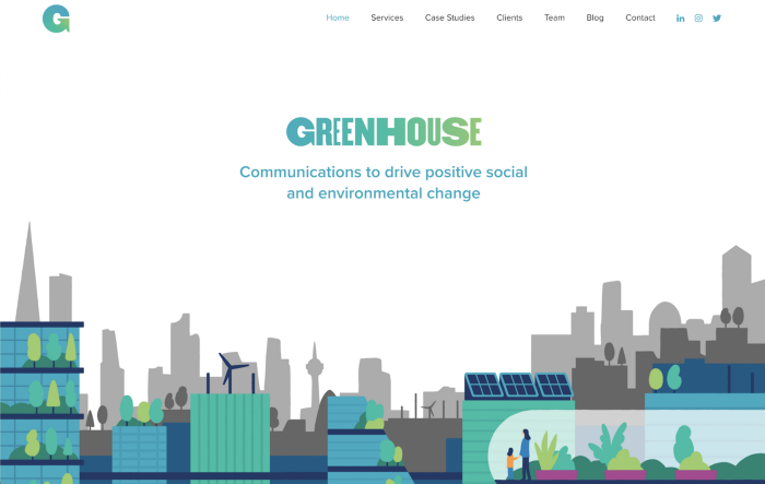
We worked with green agency Greenhouse Communications on a six-month project to bring its brand into line with its ambitions and recent growth. It was looking to better demonstrate their transition away from solely a PR agency to integrated comms agency, which could provide a whole range of creative solutions. To do it confidently, it would need a brand refresh, new website and a range of assets to help it continue to evolve.
We’re in the midst of a climate emergency — something that will impact us and every generation to come. Communications plays a key role in changing behaviour, scaling climate solutions, and influencing policy. Greenhouse is the ideal agency to tackle these challenges, it just needed the brand that made that clear — and ideally that brand needed to be ready for COP26 so it could confidently sit face to face with other difference makers.
Deep dive
We’re huge believers in developing from what’s already there — identifying the ‘brand equity’ (the truths, beliefs and behaviours behind the brand) and using that as the basis of the rebrand. By doing that, we can make sure that the refreshed brand is still recognisable at its core, whilst emphasising what makes it different and compelling.
First up, we investigate. For Greenhouse we started with a series of audits on peers, competitors (more on this word later) and the current Greenhouse brand, before we moved onto workshops with staff and current clients to find out what the internal and external views really are. All of this helps us see the real picture, not just what the briefing document tells us.
Because of the pandemic, all of our sessions were done remotely. We ran these workshops using Miro (side note: check our wellbeing workshop) and surveyed a broad cross-section of the team in the London and Bristol offices.
We quickly discovered that they are overwhelmingly happy, inspired and united people! They believe in what they are doing and were thoroughly invested in Greenhouse expanding so it could make a bigger impact. They use positive words like ‘collaborative’, ‘supportive’ and ‘passionate’ over and over again, and flavour them with others like ‘energising’, ‘impactful’ and ‘curious’. A good start.
Focused interviews
We then held some more focused interviews with team leaders to find out more about how Greenhouse operates. Employees feel empowered, listened to and just as rewarded by what they are doing and the training they received, as much as they are financially. And again, we kept hearing the word ‘impact’. Everyone wanted their work to make an impact, with many employees wanting the brand to be a little more bold, unafraid to call out the bad guys and to take an obvious stance.
We also used this time to identify the audience that Greenhouse wanted to be reaching. Primarily this is pioneers, NGOs, campaigners and B-Corps (we’ll explain those later), supported by a secondary audience of future talent & media.
This process not only unearths valuable insights, but as we’ve found over and over again, it helps to build a genuine connection between the Something Familiar team and the client we’re working with. In this case, we felt that our transparency and openness with the Greenhouse team helped them be the same, and we could see them buying into our process as they got to know us. By the end of these sessions, we could feel that everyone at Greenhouse trusted us to support this important transition.
Most of this was echoed by members of the team. A potential challenge we identified was the need to appeal to a variety of audiences. From climate activists, NGOs and businesses driving positive environmental change, Greenhouse wants to support all of these audiences simultaneously.
This approach was obviously working, as our interviews with current clients showed. The overwhelming feeling was that Greenhouse shared their beliefs, was an agency with soul, was committed to what it was doing and provided a partner experience. Many expressed excitement that Greenhouse would expand its services, so it was clear that the timing for this rebrand couldn’t be better.
It’s alive
With all this information about the culture of Greenhouse, we could map its brand values and start answering important brand questions like ‘Why are you here?’, ‘Who are you here for?’ and ‘What makes you different?’. These answers would lead us towards the airtight positioning that would express everything we’d learned about the brand and where it wanted to be in the future.
As for those questions, we’ll just focus on one: the answer to ‘Why are you here?’. This mission statement needed to capture not just what Greenhouse did, but the unique way it went about it. The statement needed to be something that anybody in the agency could say out loud and feel that they meant it.
“We believe passionately in the power of communications to drive positive social and environmental change.”
With ideas like ‘belief’, ‘passion’, ‘power’, ‘positivity’ and change all in a single short statement, and coming from everything we’d learned so far, Greenhouse’s mission statement set the foundation for everything else.
A personality with impact
The final piece of the brand culture puzzle was to identify the brand’s personality. This isn’t just about who Greenhouse is, but the way in which they communicate. Imagine a combination of a charity like WWF with the transformative power of a brand like Dyson. Pretty exciting.
To bring that personality to life across all kinds of comms, we defined it as:
Inspirational — using words to drive action
Exciting — full of possibility
Transparent — reassuringly plain and simple
There was one other element we wanted to introduce too: at every turn, Greenhouse people were very clear that they wanted to make an impact. They wanted to be noticed and to make a difference individually and as a team. With the agency looking to reposition itself, we gave them a new description, from this point on referring to Greenhouse as ‘an impact agency’, something that chimed with everybody there.
Visual, language and landscape brand audit
While all of this culture exploration was happening, we were also digging into the look and feel of the existing brand. Visually we felt that the current design didn’t deliver the Greenhouse personality — it simply didn’t have enough buzz to represent the passion of the team. The colours lacked depth, and the design felt very safe and ‘stock’.
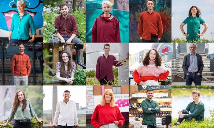
Where Greenhouse’s existing website delivered in spades though were the shots of the team. These stood out to us as capturing the agency’s culture, and was something we wanted to carry through into our own designs.
We found that exactly the same was true when it came to language across the site. Most was safe and formal — not quite the magnetic, spirited voice you’d expect from an agency driven by passion. But again, the sections involving the team really stood out. As each person explained what they did and why they did it, we could see their passion. It was inspiring and attractive, and was something we wanted to be a more obvious part of the brand moving forward.
Finally we looked at what other agencies were doing on social and their websites. Normally we’d call these ‘competitors’, but as we’ve learned, B-Corporations don’t see the world in those terms. Because they are driven by a purpose, all B-Corps are effectively working together to generate positive change. And what is a B-Corp? It’s a for-profit business that’s been certified for its social and environmental performance, and it’s something that Greenhouse is very proud to be.
Having said that, it didn’t stop us turning our critical eye onto those other agencies, and we found a host of busy sites, where earnest messaging and a proliferation of environmental images often got in the way of a smooth and considered UX. It made us more confident that we could help Greenhouse stand out with a stripped-back & focused approach and a very clear hierarchy of information.
Site structure
An audit of the existing site structure may not sound as cool as design or brand personality, but it’s an integral part of any rebrand or website project we take on.
We discovered that Greenhouse’s site had steadily grown over 12 years, both in terms of organic visitors, but also in physical size, with multiple iterations of pages and a huge library of almost daily blog posts. This unmanaged growth comes at a cost to website performance, and ultimately website sustainability.
It was clear a content audit was on the cards, and therefore the opportunity to make changes to the site structure and build user journeys for our different audiences.
It was important that Greenhouse attracted the right clients: with many businesses jumping on the green-bandwagon the site needed to feel pitched towards green business leaders, NGOs and campaigners — groups that could make a positive impact in partnership with Greenhouse. This influenced the tone of voice, UX, and content considered on each page.
Maintaining SEO performance was also a major consideration in this project. The Greenhouse site already ranked incredibly well and by exploring the analytics we could see there had been a 40% increase of traffic from Feb 2020 to Feb 2021 alone! This was despite a comparatively slow site speed, which scored just ~69/100 for desktop visitors and only ~38 for mobile using PageSpeed insights, and an F on GTmetrix.
On top of this, and in line with shared values, we wanted to move the site to a more sustainable hosting platform, we decided on Kualo. Powered by 100% renewable energy, building an optimised site on Kualo’s platform would ultimately save carbon and feed directly into Greenhouse’s 100% commitment to its green mission.
“With over 1.7 billion websites live on the internet. All those websites have to be stored and loaded from a physical server somewhere in the world. With the average size of a web page now at over 2mb — that’s a massive amount of data being sent and received across the internet.
Sending and receiving data takes processing power. Processing power uses electricity and produces heat. Electricity is *still* being generated from fossil fuels more than it is from renewables.”
– Source: https://the-sustainable.dev/
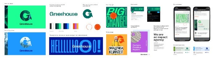
Stylescapes
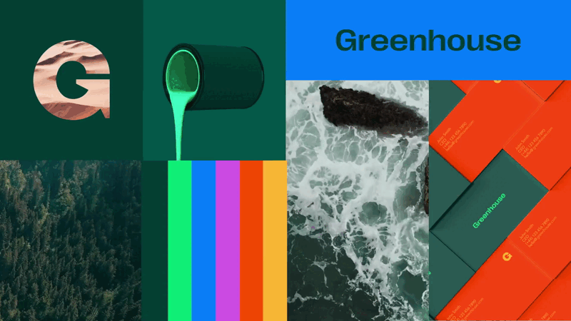
It’s a word. Rather than dive into designing a homepage or a campaign, we create a series of brand worlds that show what it might look like if we made certain design decisions. They’re a combination of design concepts, colours, typefaces and moods. They’re a playground where we can all have fun. Everyone shows the potential DNA of the brand, and we call them stylescapes.
Over two rounds of these stylescapes, we refined our thinking into five possible directions which focused on a single-minded design, using bold colours confidently and images consistently, and bringing the team’s passion and zeal to the forefront.
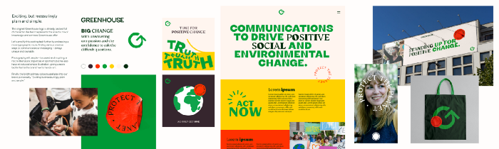
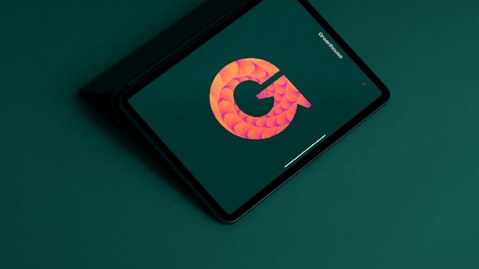
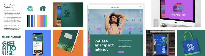
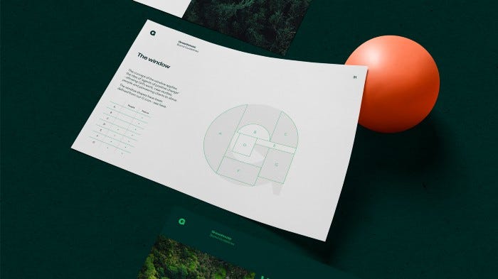
One stylescape in particular hit home, ‘Patterns, People, Perspective’. The bold lines, typeface and primarily green/blue colours all connected with the Greenhouse team and was a platform that would let it make strong, impactful statements before delivering the details. This was combined with a window/framing idea we had for the Greenhouse G icon, which let us connect the agency directly to the world it was looking to transform.
With this visual DNA agreed, we could start testing and refining the elements. And the way we did that was by using them to design, starting with the website, the single biggest part of the brand refresh.
Website design and brand guidelines
We often get asked why the brand guidelines are one of the last things we put together. It’s simply because we prefer to test our design elements in real-world settings, against real brand collateral. As we concept and create, and we get a feel for how the elements of the stylescapes can be used best, we start to come up with the rules. In this way, our guidelines are practical, not theoretical — and won’t break the first time they’re used on a new project.
So through iteration, internal review and client review, we designed Greenhouse Communications’ new website with a much clearer presentation and hierarchy, a more streamlined structure, a bolder and confident look, a considered approach to using images, a smaller footprint and a more passionate and expressive voice. This was all strengthened with a brand new URL: Greenhouse.agency
And as we did that, we interpreted and noted the rationale behind the decisions we made so that anybody could follow the same design process with our guidelines.
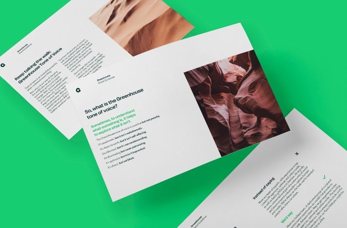
Tone of Voice
The guidelines also included a TOV section, driven by the need to keep Greenhouse’s communications as passionate and impactful as the people themselves. Rather than bog everything down with pages of rules, we stated what we wanted to achieve, how important the right language was to drive real positive change (no pressure then), and then some examples of what we were aiming for.
We knew that the natural language of everyone at Greenhouse was very passionate and enthusiastic, so our TOV guidelines just needed to keep them heading in the right direction without becoming too heated. Like a lot of the project, it was about striking the balance between commercialism and activism.
Results
The team at Greenhouse feels energised and passionate about the new brand and website, and made short work of redecorating their Bristol offices with their new logo — bold and beautiful. It’s now confident in moving forward and starting positive conversations with new potential clients and partners.
To ensure the team felt ownership of its new website, we hosted a number of website tutorial sessions, covering all aspects of the new WordPress build. We showed how easy it was to make changes to any area of the site so the team could simply update it to reflect Greenhouse as it developed without compromising on quality. The ability for clients to take control of their sites with minimal external development support is something we’re incredibly passionate about, and we build it into all of our projects thanks to our no- and low-code WordPress experience.
We increased website speeds significantly. Desktop and mobile now consistently score 90+ on PageSpeed insights. GTmetrix also now shows a grade A, a huge improvement from the previous F. This was all achieved without compromising future editability and performance.

This huge increase in performance drastically reduces our impact on the environment.
Running the site through digitalbeacon emissions calculator helps demonstrate this.
The optimised site is now incredibly light at only 444.53kb, and a visit only generates 0.329g per visit. The site was also featured as part of the lowwwcarbon.com showcase.
On top of this, performance increases have also been seen when it comes to user engagement. In just the three months following the launch in August 2021, the average number of sessions per month increased 15%; new user sessions have increased by 29%; and total clicks from Google have increased by 30%!
We’ve also seen an increased average dwell time on key pages of the site since launch. In particular ‘what we do’ has seen an approximate 180% increase compared to the eight months prior to launch. These results demonstrate the impact of a brand refresh and give us some key insights: audiences re-engage with and spend time on pages that really communicate a brand’s purpose.
With the guidelines to hand and the Something Familiar team just a call away, the Greenhouse team was able to take immediate ownership of the brand and start using it consistently and impactfully across all of its comms. As we waved our most recent project over the horizon, it was good to know that it was going to play a major role in driving real positive change in the future! Roll end credits.
“We have been really impressed with the care and attention that you and the SF team have put into getting the designs right for us. I know that we have not been the easiest of clients and there has been some back and forth, but I wanted to say a HUGE thank you to you and the team for all the work.”
– Anna Guyer, Founder Greenhouse Communications