

A startup idea captures the world’s imagination, with business expanding rapidly. But does its original branding still ring true when you’re now ready to amplify your position as a market leader?
We helped Appcast deal with this situation with a brand refresh, UX rework and repositioning that prepared it for a leap into the mainstream. It wanted to move from being a behind-the-scenes solution provider, to being the starring role in the solutions it was providing to big brands. The key was to do this without losing the spirit or energy that characterised its early years, something we call ‘brand equity’.
Here’s what you need to know: Appcast uses its programmatic technology to match the best candidates to vacancies. It makes the recruitment process incredibly simple for the people doing the hiring — but of course in the background it’s doing some very complicated things with data.
Appcast was ready to fly. We needed to give it a solid brand platform to launch from.
Turning over every stone
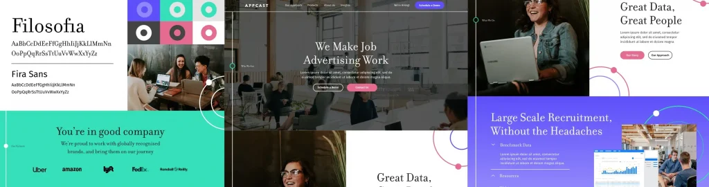
We started by exploring the current Appcast brand. Which elements would we take forward with our refresh? We wanted to build on existing brand equity, so it would be clear that this was still the Appcast existing customers loved and trusted. It was essential that this important group were considered as thoroughly as prospective customers and not alienated as the brand evolved.
We spotted an important insight in an internal study of buyer personas: it showed Appcast needed to cross the chasm between the innovator/early adopter market and the mainstream. This gave us a clear steer, that our focus needed to be on moving the look and feel of Appcast from a complex data brand into something more approachable. It would need to feel simpler and more human, but without losing the power of all that data.
So who better to turn to than actual humans?
We talked to stakeholders, staff and customers to find out what they thought of the existing brand and discover that Appcast was:
- great at understanding and helping its customers
- transparent and honest
- confident in its category-leading tech
- driven by a love of data
- happy to embrace its nerd status
This was a great foundation, with words like ‘respect’, ‘support’ and ‘honesty’ used as often as ‘innovative’, ‘creative’ and ‘leader’. It played perfectly into our plan to create something simpler, more human and able to connect with more mainstream audiences.
Our audit of how Appcast communicated and how that compared to competitor and peer brands helped us become fluent in the successful visual and verbal ‘language’ of this sector. This meant we would know when we were going with — or against — the flow during the creative stages.
We also discovered that this was all a huge step out of Appcast’s comfort zone. We needed to consider the team’s data-driven way of thinking at each stage of our often abstract work, so we could all meet in the middle. As the project progressed, Appcast could more clearly see the way ahead, and embraced our approach completely.
Now we had a solid picture of what Appcast was, and where as a brand, its strengths lay. We felt that Appcast’s product and the way it delivered it was disruptive, but that the brand did not have the assets or energy to back this up. There was a disconnect and we were here to join the dots.
Personality and values
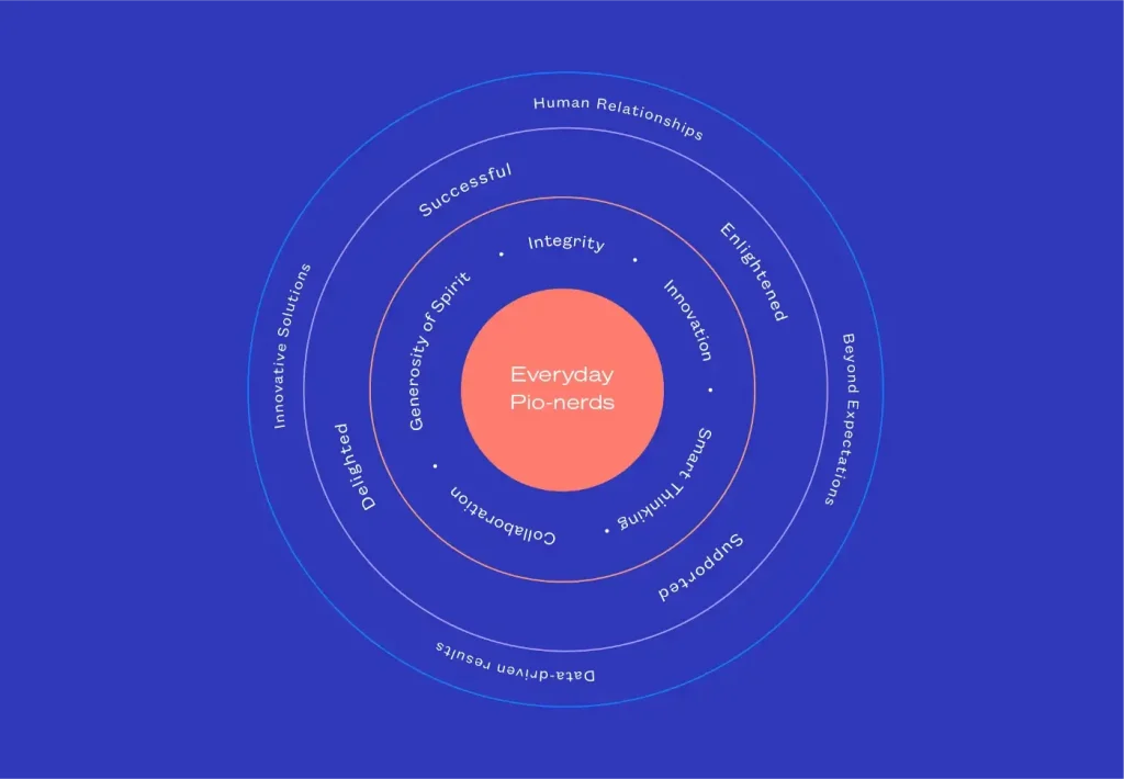
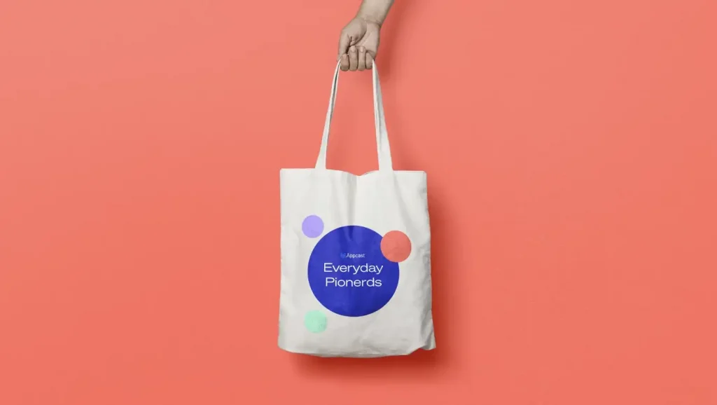
Drilling down into Appcast’s personality pinpointed four attributes that the refreshed brand needed to embody: Approachable, Inspiring, Determined and Nerdy. The data-loving Appcast community embraces the term ‘nerdy’ so much that we coined the term ‘Pionerds’ to capture the spirit of the whole project!
At this stage, because we’d explored every facet of the brand, including the language it currently used, we were in the perfect position to write a Tone of Voice guide. This would underpin a new style of communication and give everybody the tools and confidence to write in the Appcast voice.
It’s intelligent, but it’s not arrogant.
It’s approachable, but it isn’t patronising.
It’s inspiring but not preachy.
It’s helpful but never pushy.
It’s self-assured, but it isn’t boastful.
It’s direct, but not blunt.
Giving it a little something something
We created a number of stylescapes based on our research into the brand and its personality. Each one was based on a different concept that would support a simpler, more human and more engaging approach. These concepts guided our design decisions as we created elements; explored colours, fonts & visual relationships; and illustrated various aspects of the Appcast brand, including homepages, animation, photography and even merchandise. The aim for every stylescape was to show a potential direction for the Appcast brand as it would look and feel in the real world.
We also needed to bring the Appcast logo up to date. This was the key asset, so we needed to ensure that every concept started with a simplified logo that worked practically and felt part of the refreshed brand’s world.
We presented five stylescapes, from ‘The Ripple Effect’ and ‘Journey Through Data’, through to ‘Humans not Robots’ and ‘Made Simple’.
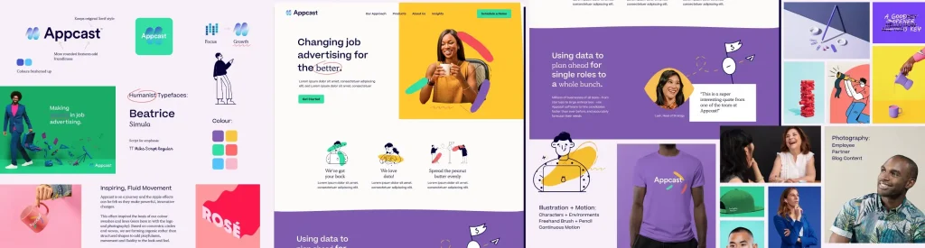
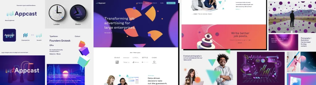
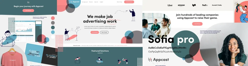
Each of these pre-design designs was a living, breathing brand, but through discussion, iteration and elimination, the Appcast team settled on one…
Made Simple.
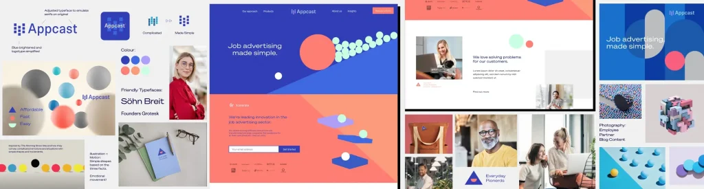
The thinking was that Appcast had taken something expensive, time consuming and complicated, and made it fast, affordable and easy. It was all about simplicity of shape and form (including typefaces), emotive movement, and a refreshed colour palette balanced against negative space. The overall effect was flowing, simple-to-grasp and engaging. And it even included an Everyday Pionerds smiley!

A harder-working website
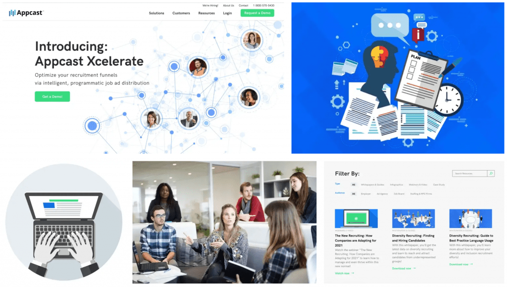
2020 has taught us how important it is to be reactive, and from the start of this project our aim was also to give Appcast more control over its website, building in the flexibility to react to what was going on in its world, and to customers’ changing needs.
We introduced a better way of handling CMS, pairing Appcast’s existing WordPress with a powerful plugin called Elementor. This is a favourite combo of ours and our clients as it provides fantastic design and build solutions with a super-intuitive interface. The Appcast team loved it.
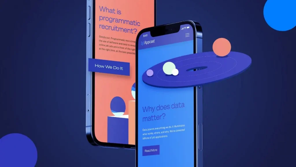
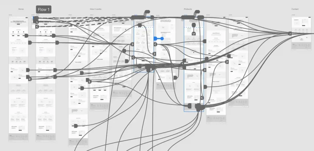
We also undertook the mammoth task of restructuring the website to make it a more engaging and straightforward experience for customers. By analysing existing user behaviour traits we could identify the content that delivered high quality conversions and ensure it was prominent in the new structure. With a focus on helping to educate prospective customers on the other side of the chasm, we also made it simple to find Appcast’s rich library of whitepapers, webinars, blogs and research reports.
The outcome
In all, the project took a little over five months to go live, and was completed in December 2020, by which time we’d built an incredibly strong relationship with the Appcast team, despite being on the other side of the Atlantic.
The brand refresh has been incredibly well received. For the website, early analytics are proving a 100% increase in dwell time compared to the same period last year. Traffic appears more targeted with an increase in inbound requests. The internal team at Appcast has effortlessly taken to the addition of Elementor to the CMS, and the site was featured in the Elementor end of year showcase 2020.
Appcast now has a brand that not only supports its growth as a leading partner to some of the world’s largest businesses, but one that can also still be traced back to the scrappy startup that originally made waves.
If you’re also looking to reposition your brand so it can actively support growth, then please get in touch!