A brand built on inclusion
The Challenge
Formerly known as ENEI, the organisation’s acronym-led and institutional identity was limiting approachability, memorability and commercial effectiveness. As the sector shifted from compliance-led DEI towards culture-led inclusion, the brand no longer reflected how the organisation actually worked.
The identity positioned ENEI as a distant authority, creating friction in early conversations with senior leaders. This increasingly slowed momentum at the point where trust and clarity mattered most. A new brand was needed to support confident engagement in complex, high-stakes cultural change.
Our Approach
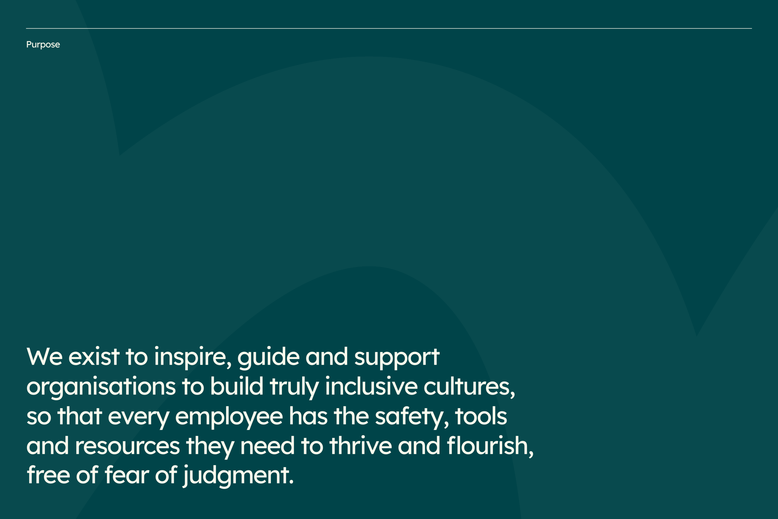
Our role was to clarify how Onvero shows up in sensitive and often complex conversations with senior leaders. Through strategy and naming work, we articulated what the organisation stands for, who it supports, and how it builds trust without diluting its principles.
We prioritised clarity and approachability over authority, designing a brand that could support difficult conversations rather than dominate them. Visual audits defined what the brand needed to move away from, alongside the qualities it needed to hold going forward.
Accessibility was treated as a core requirement, shaping decisions across the system to ensure the brand works across contexts, audiences and needs.


Bringing it to life
The organisation transitioned from ENEI to Onvero, a name created by combining the words ‘onwards’ and ‘vero’, meaning truth. The move away from an acronym removed friction from introductions and allowed conversations to focus on culture change rather than explanation.
We created a brand identity system designed to be expressive, scalable and accessible. The logo evokes support and forward movement, while the colour palette meets WCAG contrast standards. Typography was selected with the same care, using Lexend to reduce visual stress without relying on a system font.
This was supported by a clear verbal framework to guide tone, language and messaging, enabling consistent and confident communication across touchpoints.
A lasting shift
Onvero moved from an acronym-led identity that limited emotional connection and slowed engagement with senior decision-makers to a clear, recognisable presence in the inclusion space.
People are placed at the centre rather than institutional structure, building confidence internally. The new brand is now used confidently across leadership engagements, proposals and partner conversations, supporting Onvero’s ambition to influence culture change at scale.